Nederlands Dans Theater visual study combining a dancer, layered motion lines, and typography.

Selected work / 2019–2020

Color · Motion · Identity

Visual Study

Three explorations in visual language, from the intimacy of an interface to the energy of a public identity.

Practice
Visual Design
Creative Direction
Projects
Haven · NDT
TEDxSFU
Medium
Digital Interfaces
Identity · Print
Period
2019–2020

01 / Interface design

Haven

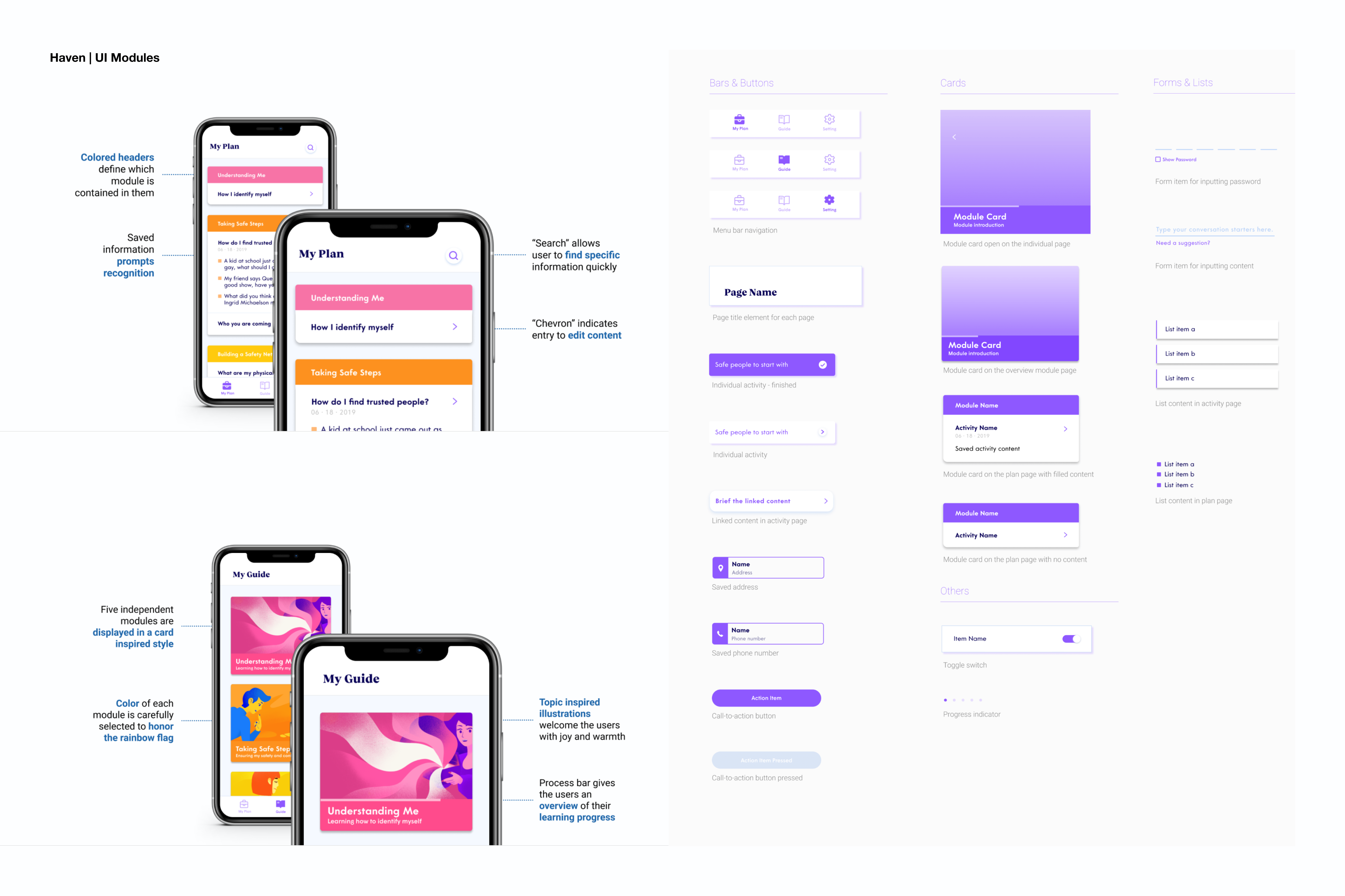
A mobile app proposal supporting LGBTQIA+ youth through the coming-out process. I contributed product and visual design, using bright, rainbow-inspired colors, welcoming illustrations, and reusable cards to organize educational activities and personal notes. The visual system balances warmth and clarity, with privacy controls designed for a sensitive context.

Product & Visual DesignSFU team projectSummer 2019

With Stephen Therriault, Tiffany Chan, Sahil Mann, and Quinn MacDonald.
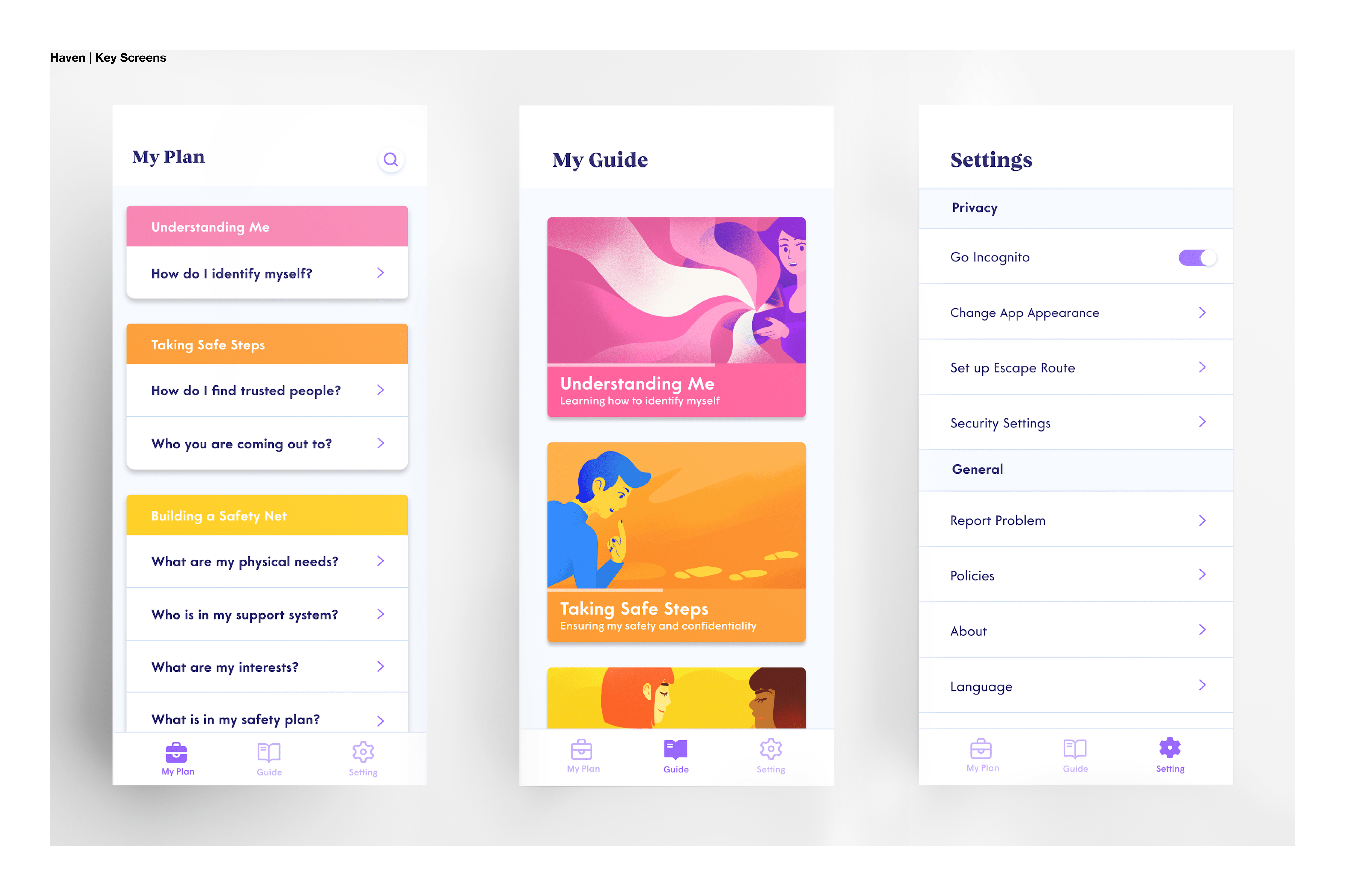
Haven key screens showing My Plan, illustrated learning modules, and privacy settings.
Fig. 01Color-coded modules bring learning, personal planning, and privacy settings into one interface.
Annotated Haven mobile screens alongside its navigation, card, button, and form components.
Fig. 02A reusable family of cards, navigation, and form elements gives the experience a consistent rhythm.

02 / Visual communication

Nederlands Dans Theater

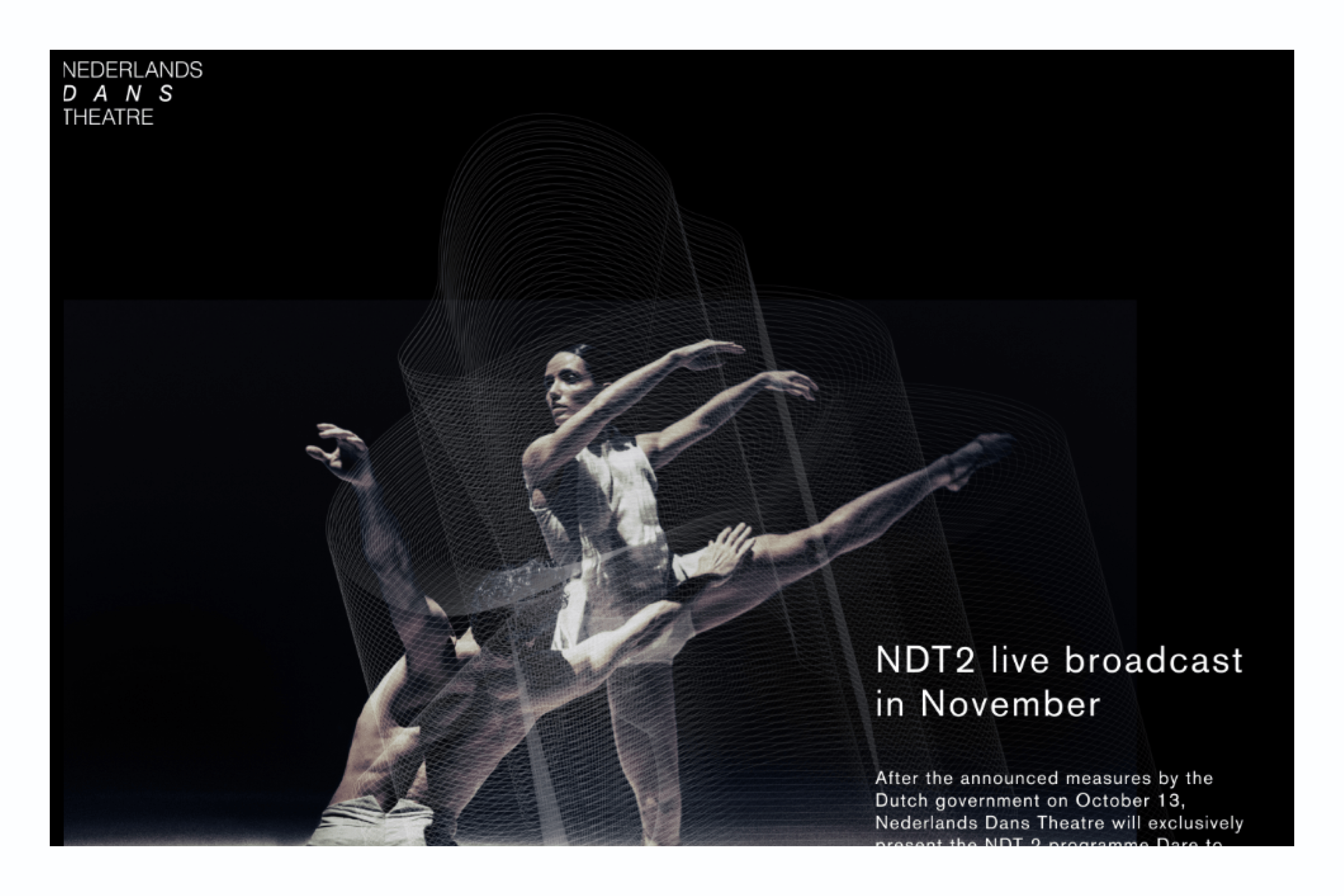
An academic branding exploration translating contemporary dance into a visual language of “boundless” movement. As visual designer, I explored rhythm, repetition, and handwritten forms, layering fine lines over performance photography to suggest motion through time. The resulting direction extends across posters and digital compositions.

Visual DesignerSFU academic projectOctober 2020

With Alison Chan, Sophia Lee, and Maggie Chan.
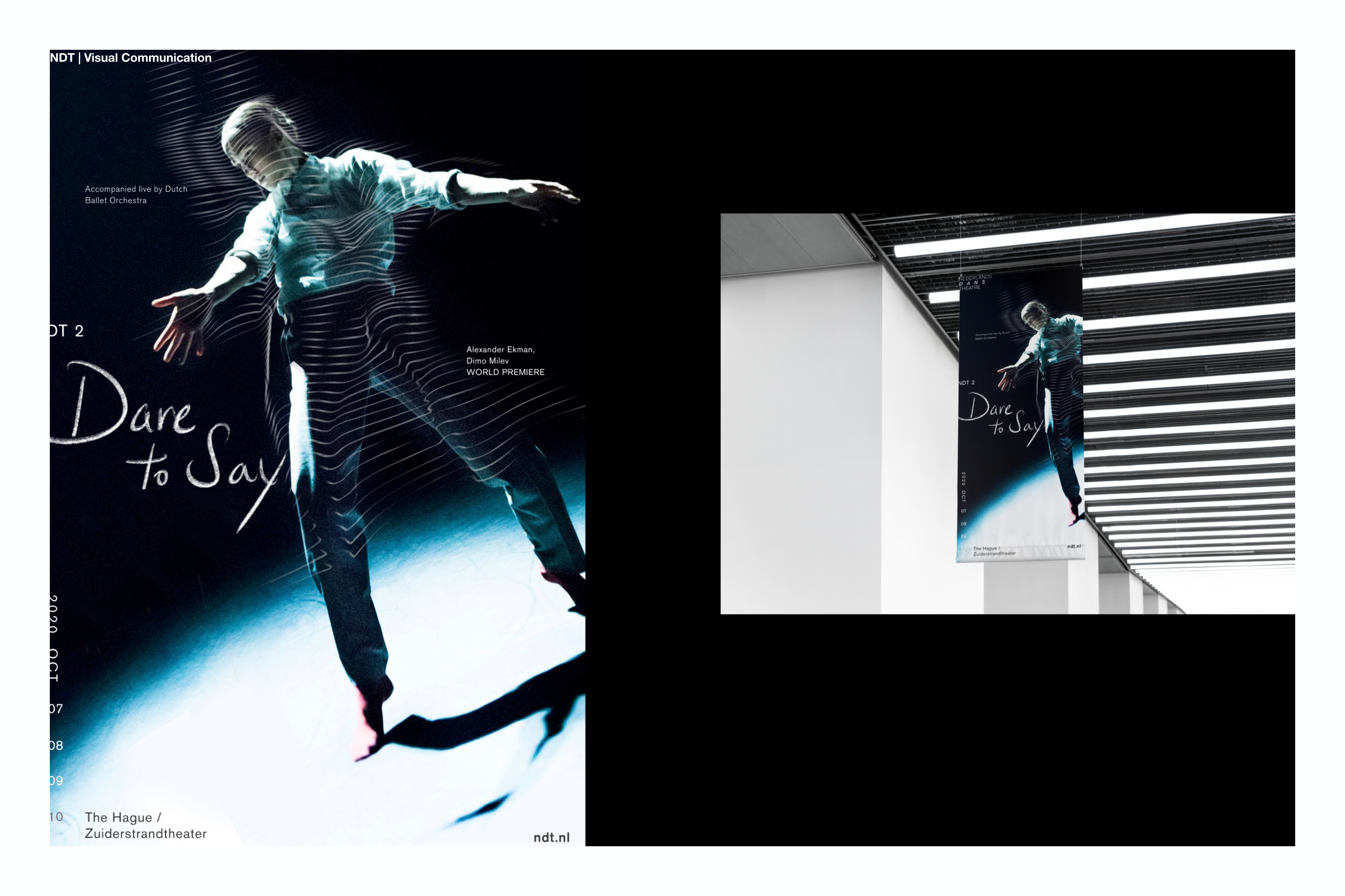
NDT dance poster with repeated contour lines and a hanging banner application.
Fig. 03Performance photography, handwritten type, and repeated lines turn movement into a graphic motif.
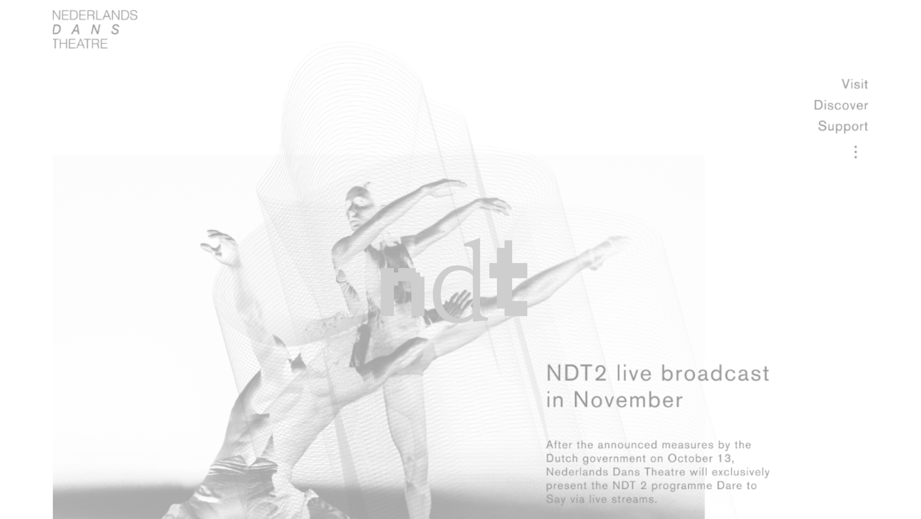
NDT digital composition layering a dancer and flowing lines beside live broadcast information.
Fig. 04The same motion language carries into a digital composition for a live performance broadcast.

03 / Visual identity

TEDxSFU — Mosaic

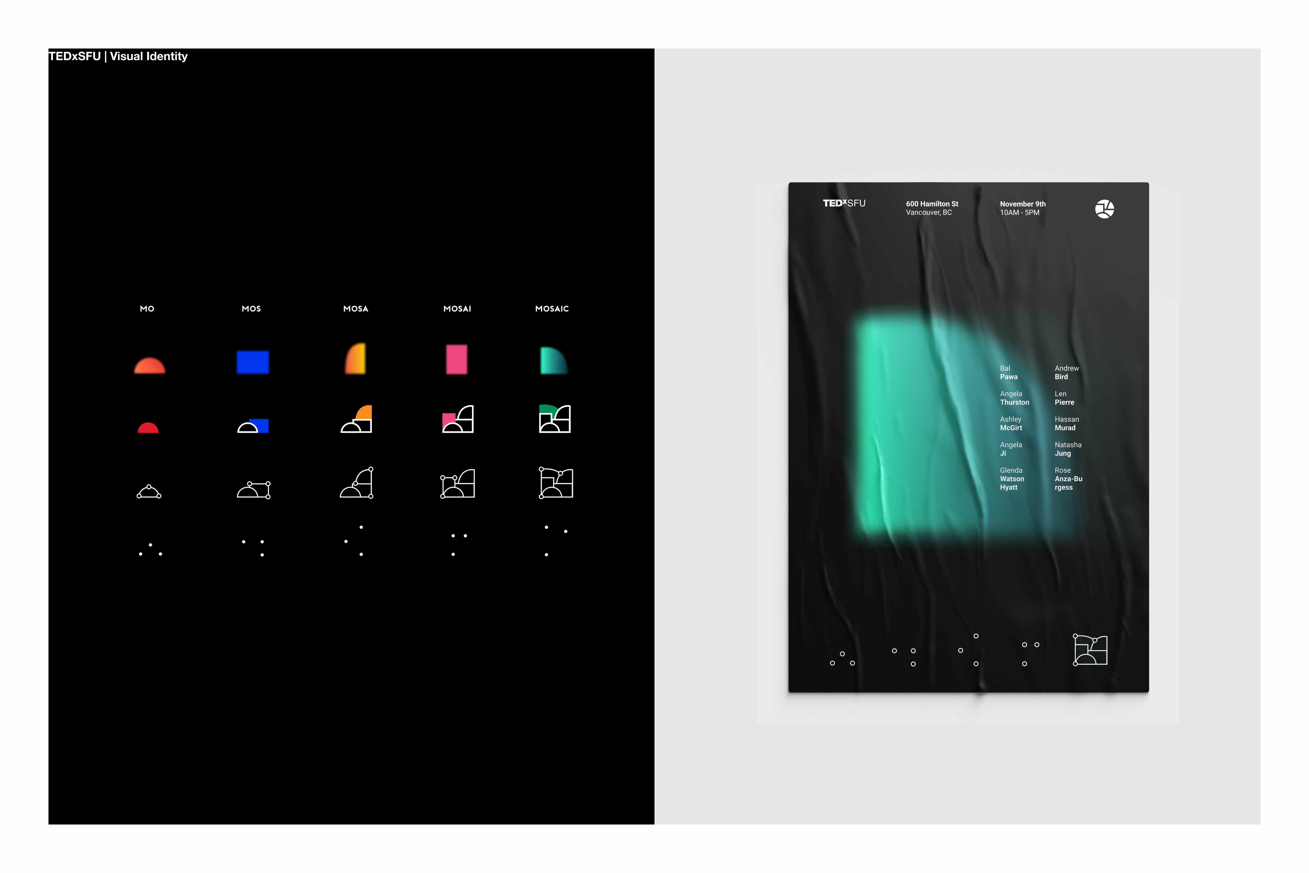
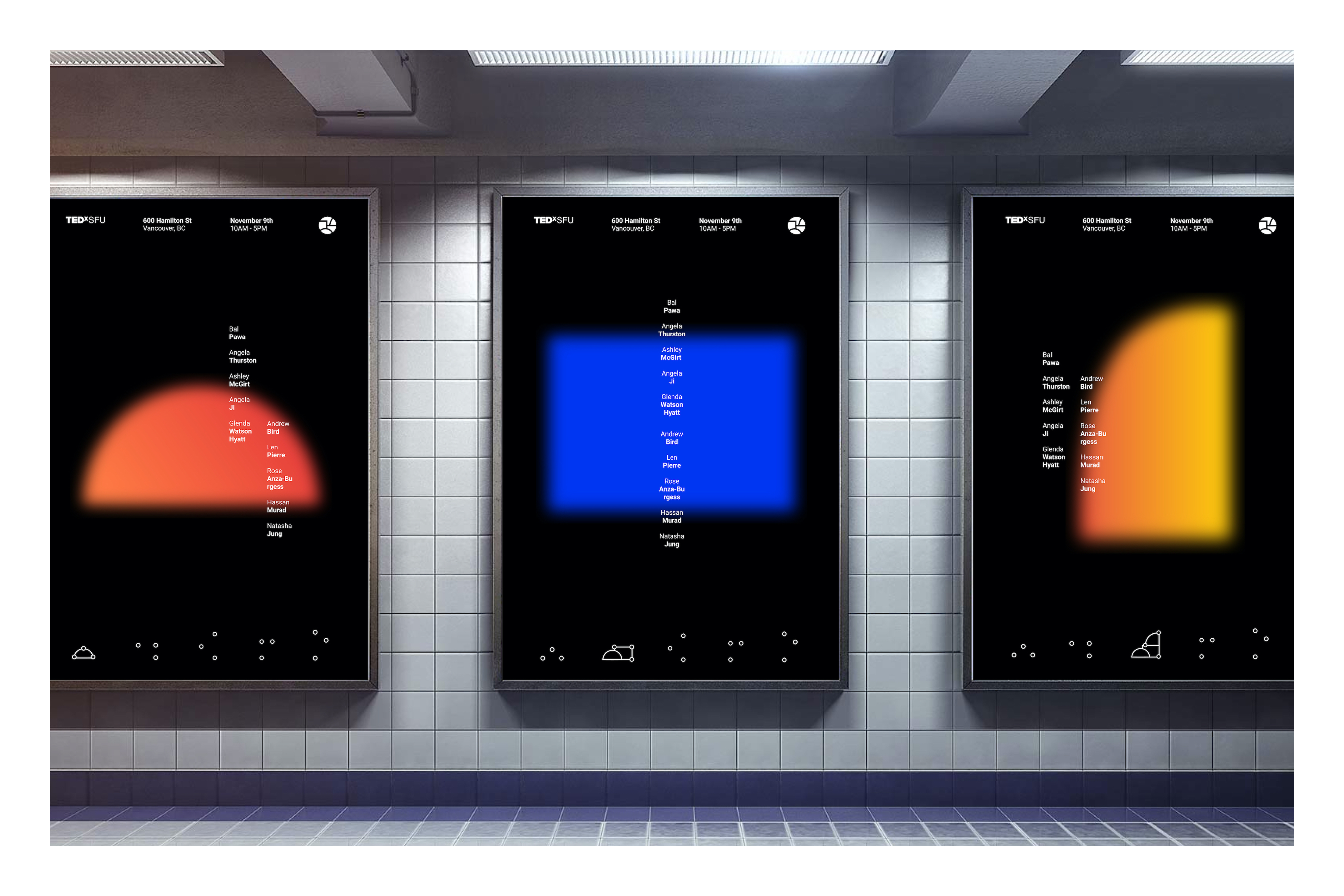
As creative lead for TEDxSFU’s 2019 event, I developed an identity around “pieces coming together.” Modular geometric forms, luminous color, and connecting points express the gathering of different stories and perspectives. Across the poster series, individual shapes retain their character while belonging to a shared visual system.
Creative LeadEvent identity2019
TEDxSFU Mosaic identity development from geometric shapes and connecting points to a poster.
Fig. 05A modular identity builds from individual pieces into a connected whole.
Three TEDxSFU Mosaic posters featuring glowing red, blue, and orange geometric forms.
Fig. 06A shared layout lets distinct colors and forms read as one event identity.