Discover.
Help customers understand what TUMI offers and where to begin.
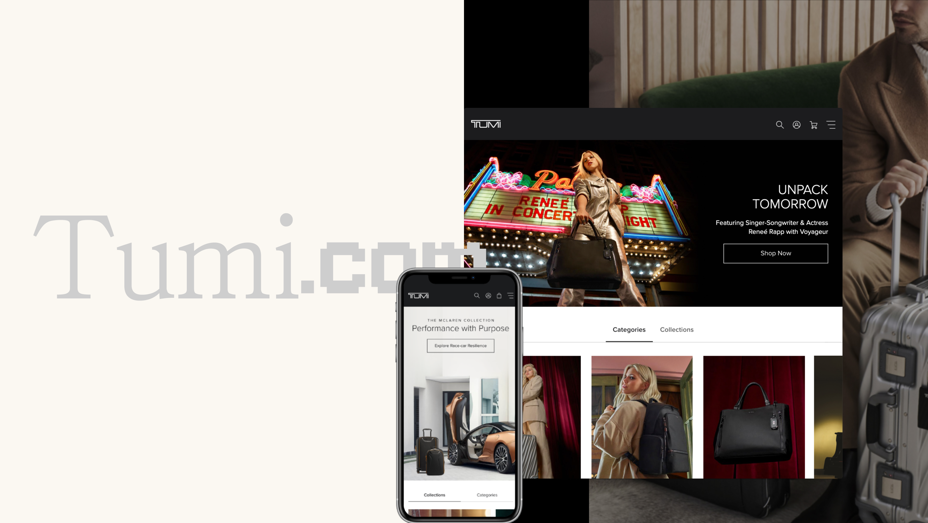
TUMI / Digital Flagship Store
Luxury · Retail · B2CI designed an adaptable component and GUI system that helped TUMI’s digital flagship flex across products, shopping intents, content types, and screen sizes without losing its identity.
The brief
TUMI needed a digital experience that could support product discovery, comparison, personalization, service, and storytelling across a complex product ecosystem.
My role was to turn a broad product vision into a flexible system that design and engineering could use to build, adapt, and scale.
01 / Context
TUMI is a U.S. luxury luggage brand generating approximately $750M in annual revenue. Its digital flagship needed to carry the clarity, confidence, and sense of service of a physical store.
Customers could arrive with very different goals: browsing by category, searching for a specific product, comparing luggage, understanding materials, checking airline restrictions, or learning about the brand.
A single rigid page template could not support all of these experiences well. The system needed a stable foundation and the ability to change with context.
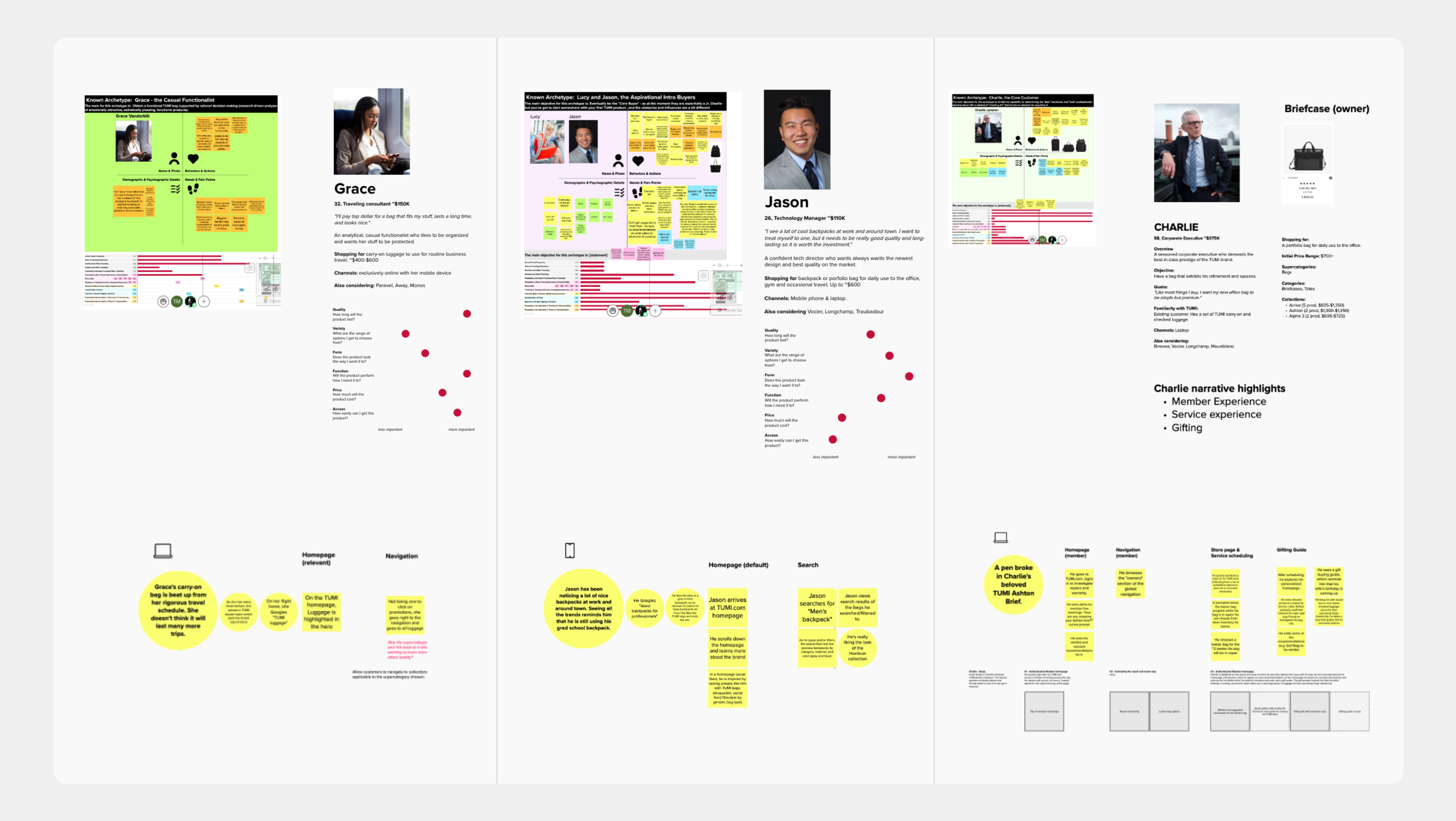
Help customers understand what TUMI offers and where to begin.
Help customers compare products, materials, features, and fit.
Make product stories, service, and brand values part of the shopping experience.
02 / Insights
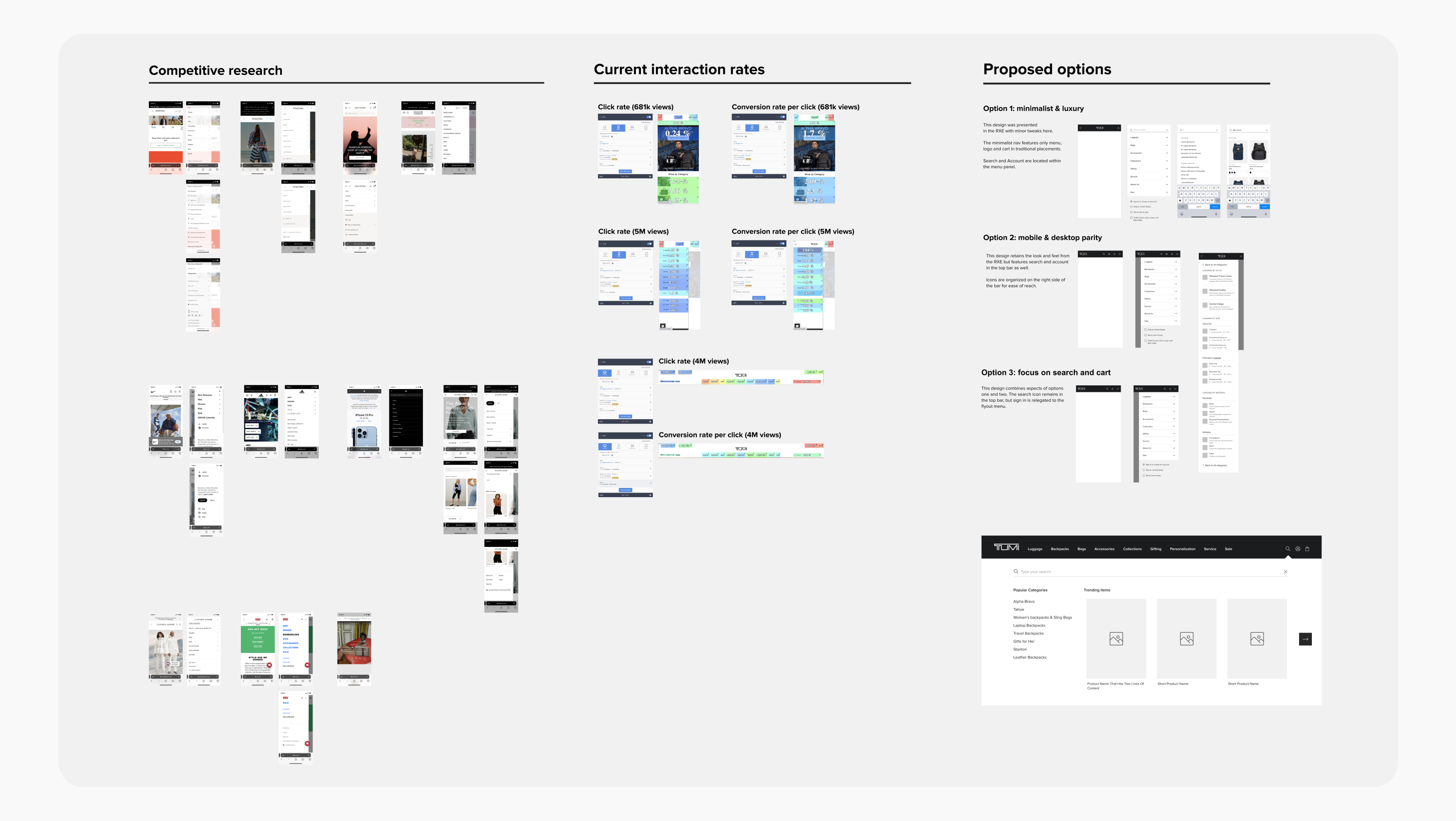
I combined competitive research, current interaction data, product requirements, customer scenarios, and stakeholder input to define what the system needed to support.
The key insight was that consistency should live in the system’s structure and behavior. The content, hierarchy, and composition could change when the user’s task changed.
Categories needed to explain where customers could go and why each path mattered.
Search should help customers explore, correct, preview, and narrow their options.
Product pages needed to combine visual storytelling with clear, transparent decision support.
30%
Search represented a high-intent shopping opportunity.
5–6x
Search visitors can convert at a much higher rate than average visitors.
98%
Product pages must reduce uncertainty before purchase.
These figures were used as directional inputs during planning and framing, not as measured outcomes from this project.
03 / The problem
TUMI’s products differed by category, material, size, use case, and customer intent. A luggage shopper needed different guidance from a backpack shopper, and a first-time visitor needed different support from a returning customer.
The challenge was to create enough consistency for the experience to feel like one flagship store, while allowing each product category and page to communicate in its own language.
How might we build a component system that adapts to content, context, and device without losing clarity or luxury?
04 / Design response
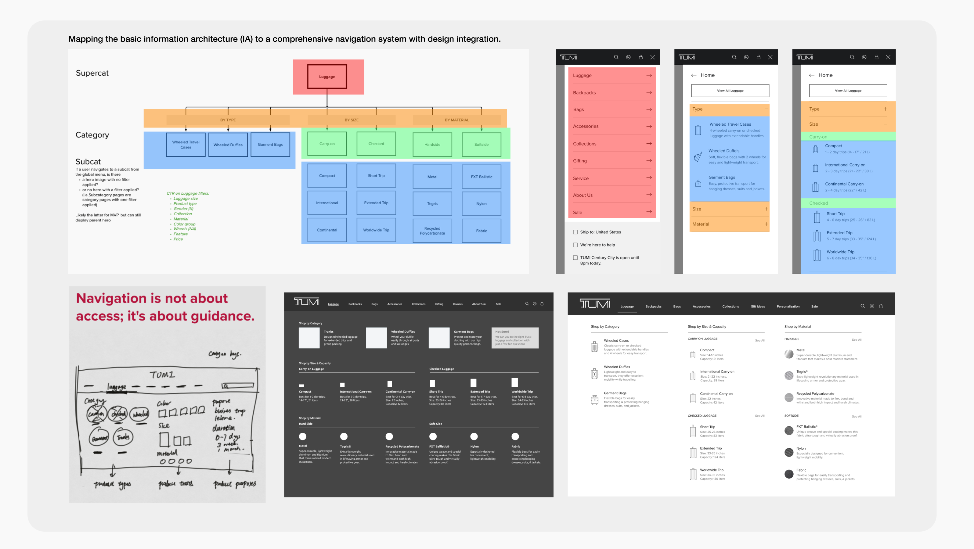
I designed the system at four connected levels: information architecture, component structure, behavior, and delivery.
The goal was not to make every page look the same. It was to make every variation feel like it belonged to the same system.
I created a shared navigation structure that could adapt to the logic of each category while keeping the overall interaction pattern consistent.
Luggage could be organized by size, construction, and material. Backpacks could be organized by purpose, laptop size, and material. Bags could use type, laptop size, and material.
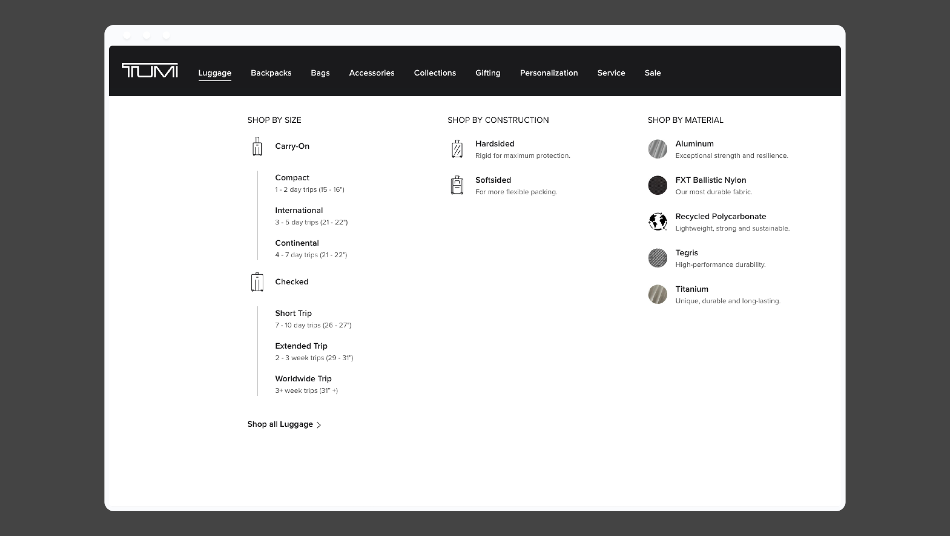
Fixed: structure, hierarchy, behavior, and visual language. Flexible: category logic, labels, icons, descriptions, and filters.
I designed search as a guidance component rather than a simple input field. Users could see popular categories, trending products, query suggestions, spelling corrections, and relevant product previews.
Hovering over a suggestion gave customers a quick preview of relevant products before they committed to a results page.
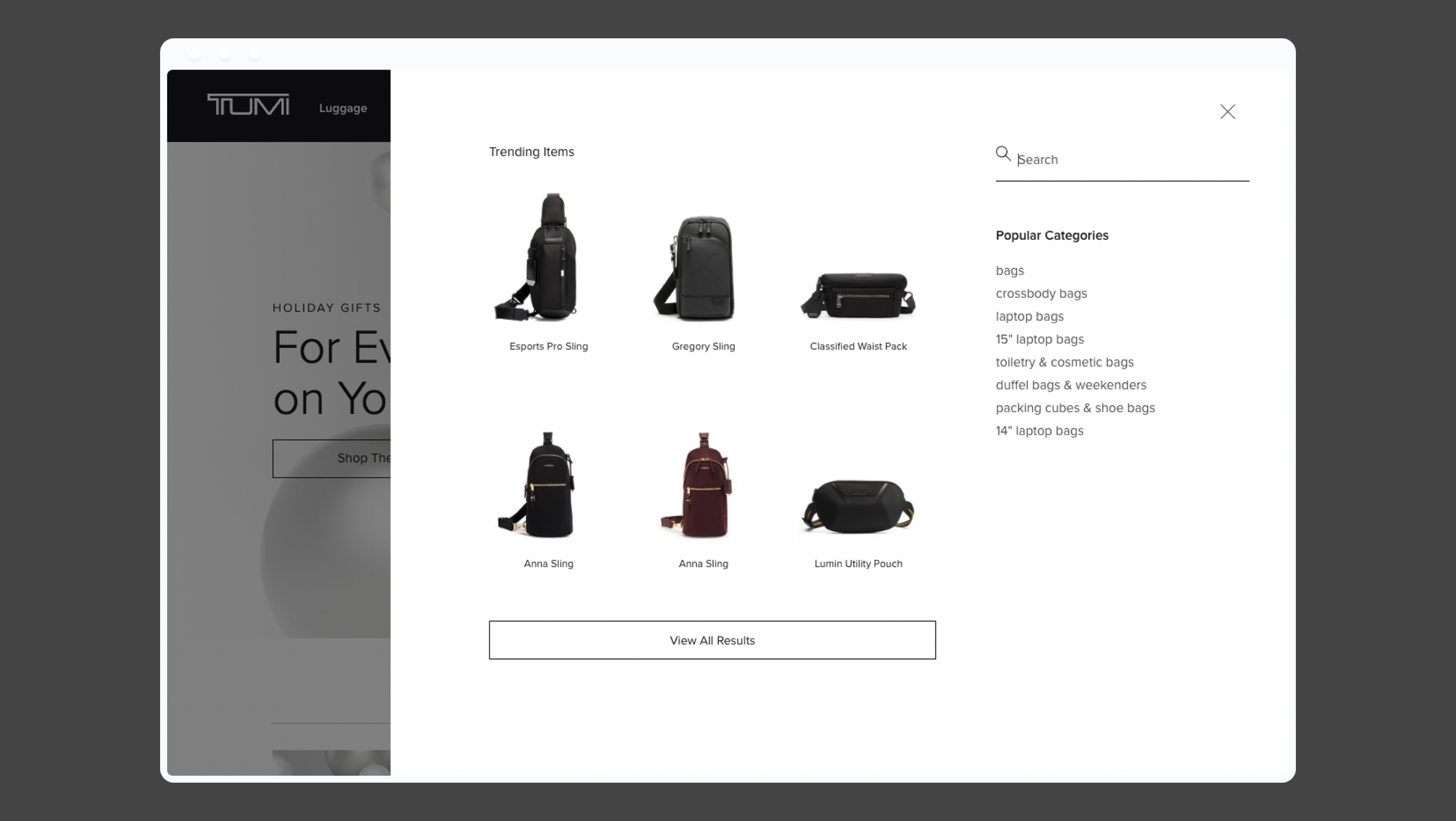
Search became a bridge between customer language and TUMI’s product system.
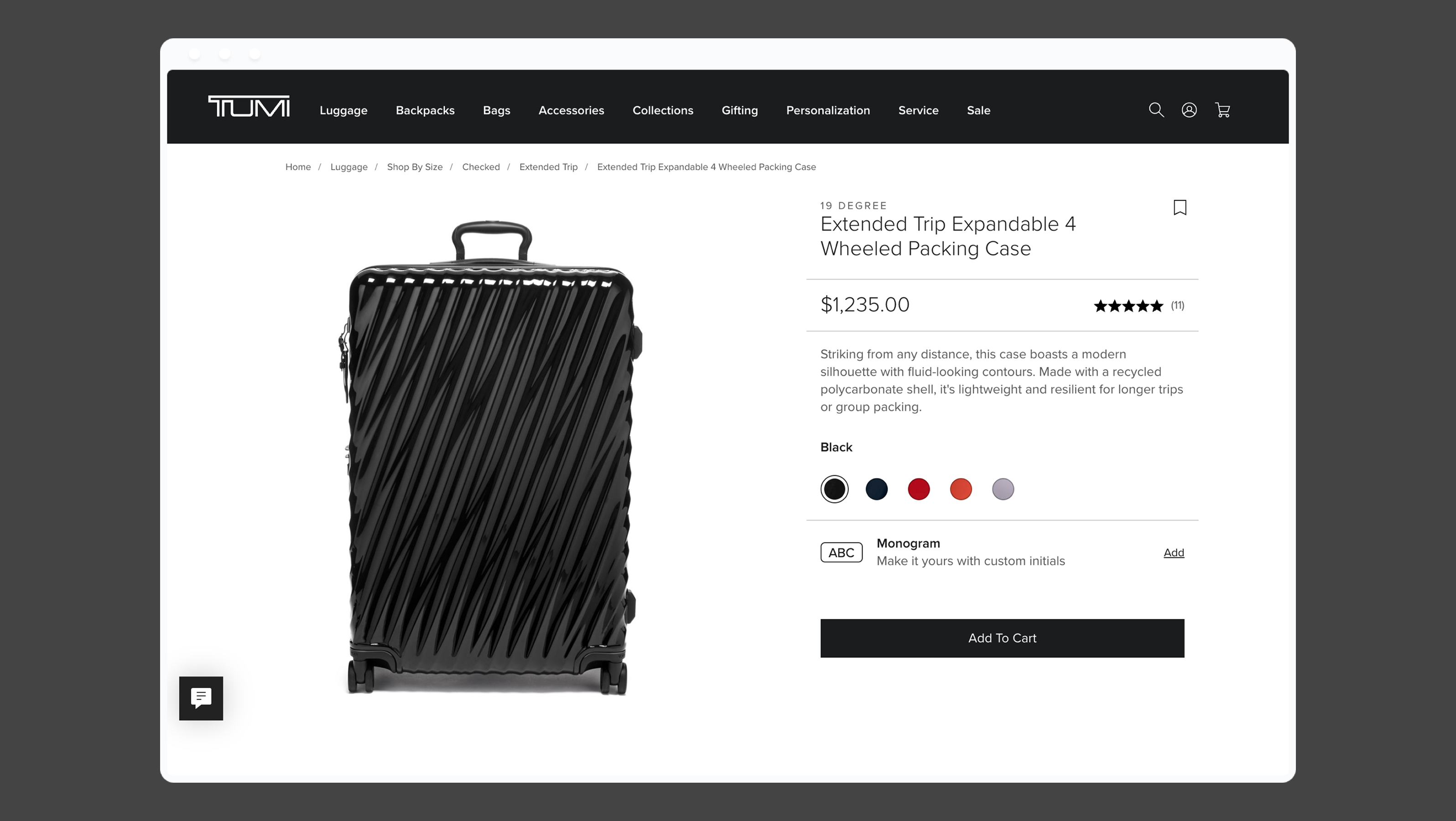
I reframed the PDP as a configurable storytelling system. Its structure could combine product visuals, specifications, reviews, service information, sustainability stories, airline guidance, and related products.
The module order and content could change according to the product and the user’s decision needs.
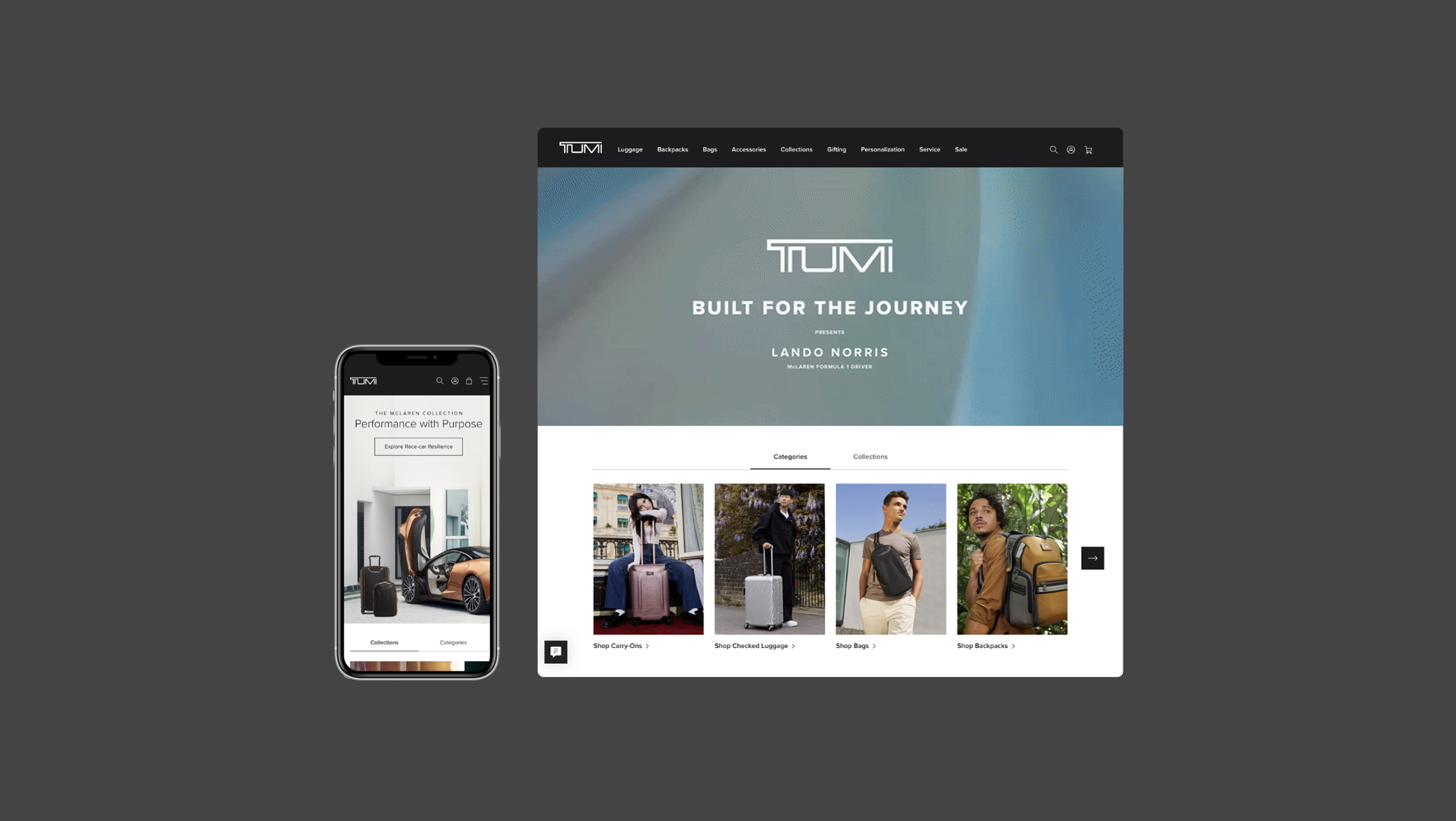
Responsive design was treated as behavioral adaptation, not visual resizing. I mapped how navigation, search, product cards, galleries, tabs, and content modules changed across desktop, tablet, and mobile.
I documented grid, typography, color, basic components, complex components, variants, states, responsive behavior, animation, and content rules.
This created a shared language for design and engineering and made the system easier to extend beyond the first release.
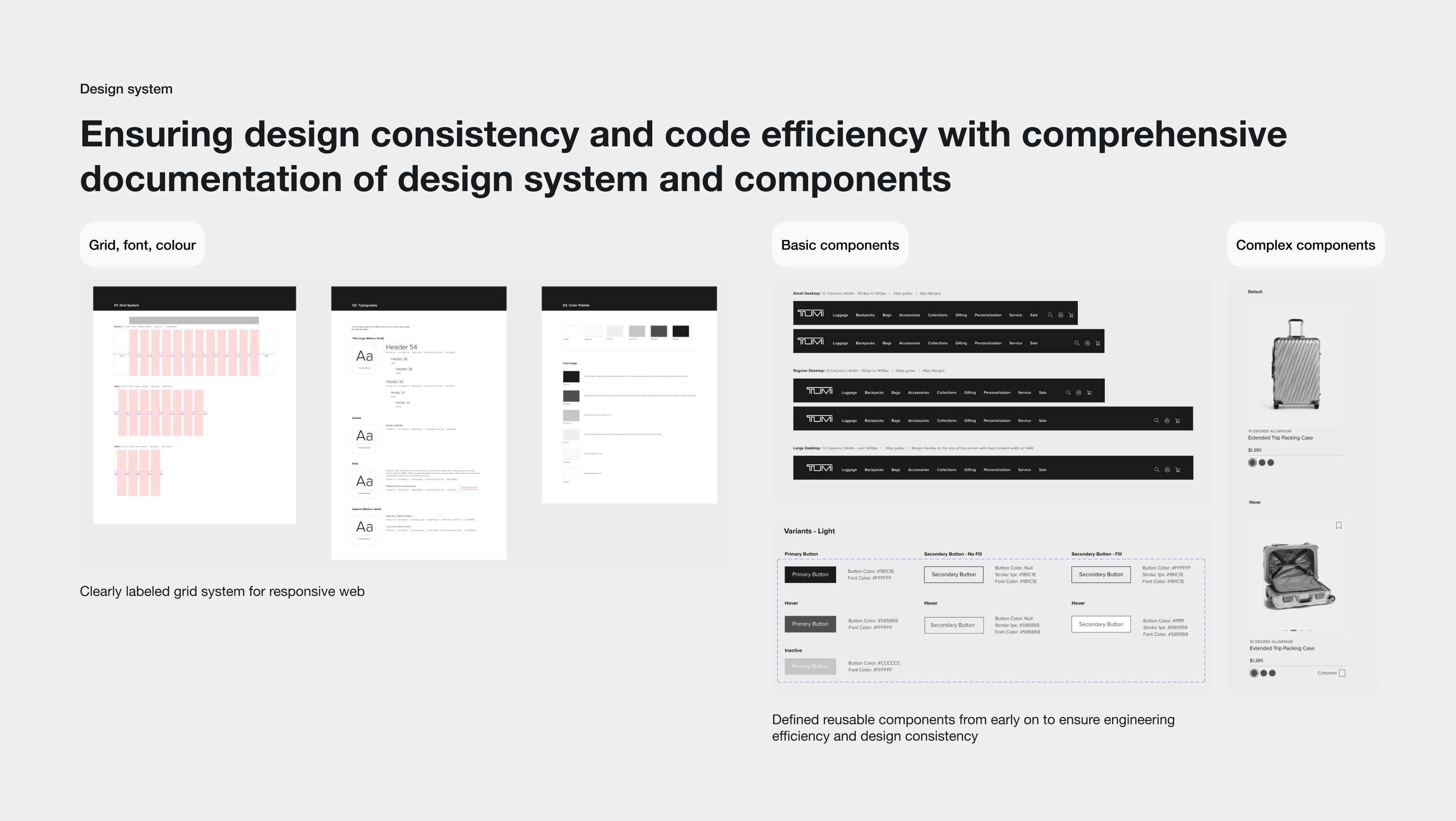
A component was defined not only by how it looked, but by how it behaved, changed, and could be reused.
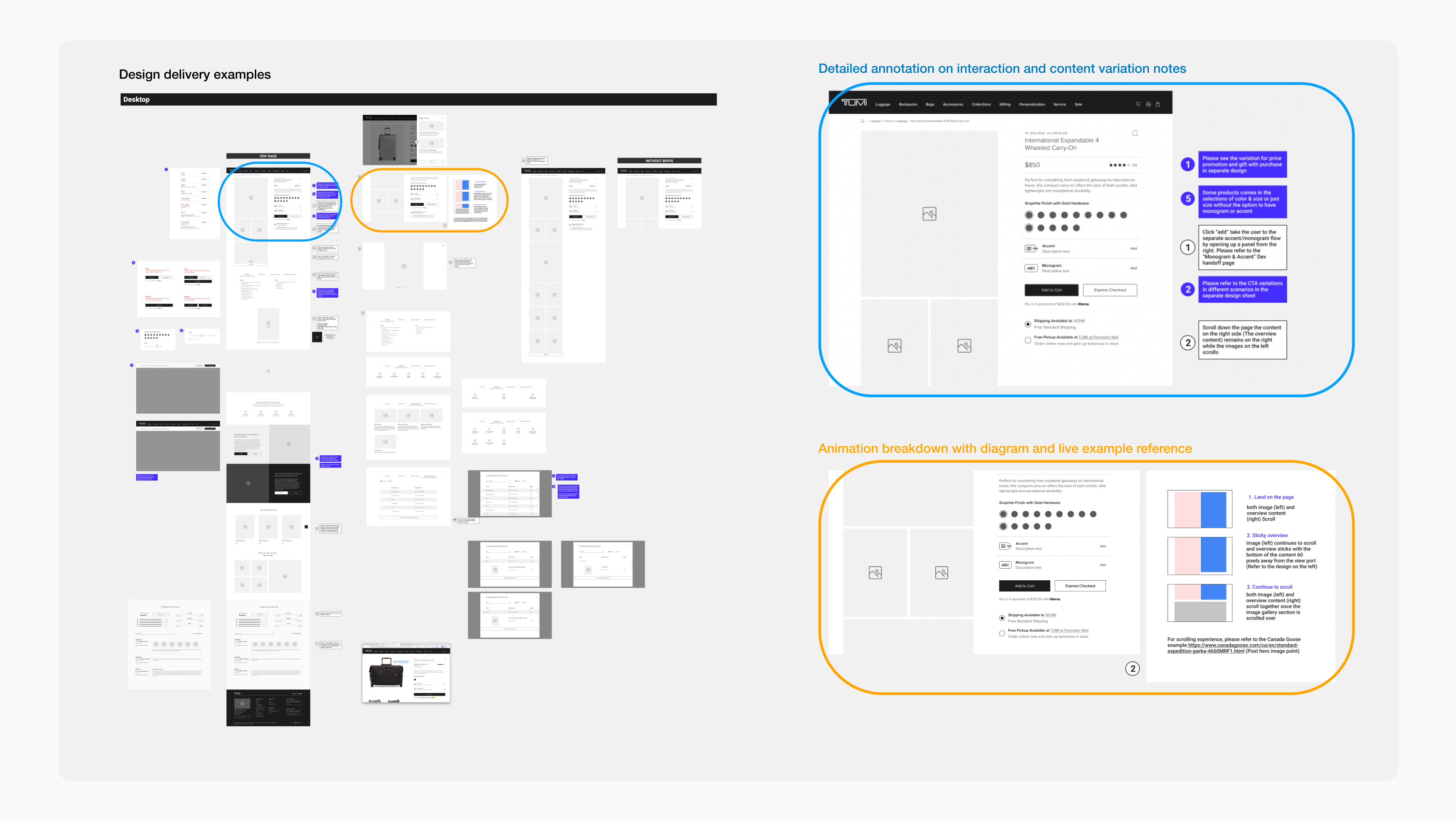
I worked closely with development from early planning through QA and launch. Delivery files included interaction annotations, content variation notes, responsive behavior, and animation breakdowns.
Early engineering feedback helped identify technical constraints before they became expensive to change.
05 / Outcomes
The work delivered a responsive digital flagship experience and the system behind it: reusable components, adaptive content structures, documented behaviors, and a clear design-to-development workflow.
20
Across navigation, search, PDP, wishlist, comparison, gifting, and service.
9
Designed and delivered across the flagship experience.
3
Desktop, tablet, and mobile behavior documented.
Final delivery included the homepage, collection pages, product listing pages, gift product pages, wishlist, product comparison, global navigation, smart search, and product detail pages.
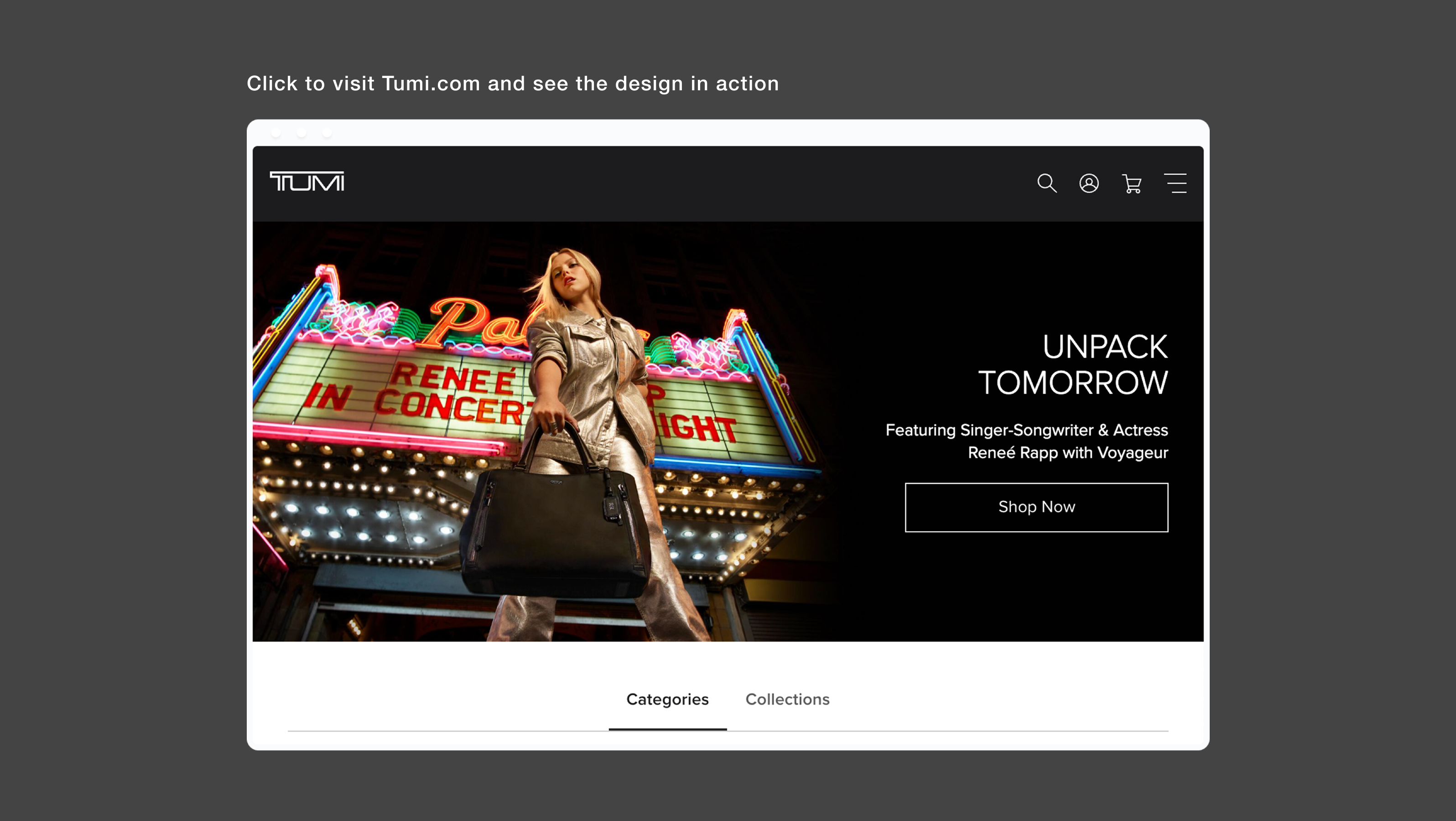
An adaptable design system is not a collection of reusable rectangles. It is a set of decisions about what should stay stable, what can change, and what conditions should trigger that change.
The strongest systems are consistent at the structural level and flexible at the content and interaction level.
I built a flexible component system that allowed TUMI’s digital flagship to adapt without losing its identity.