Coherence.
Make states, language, and system behavior easier to understand.
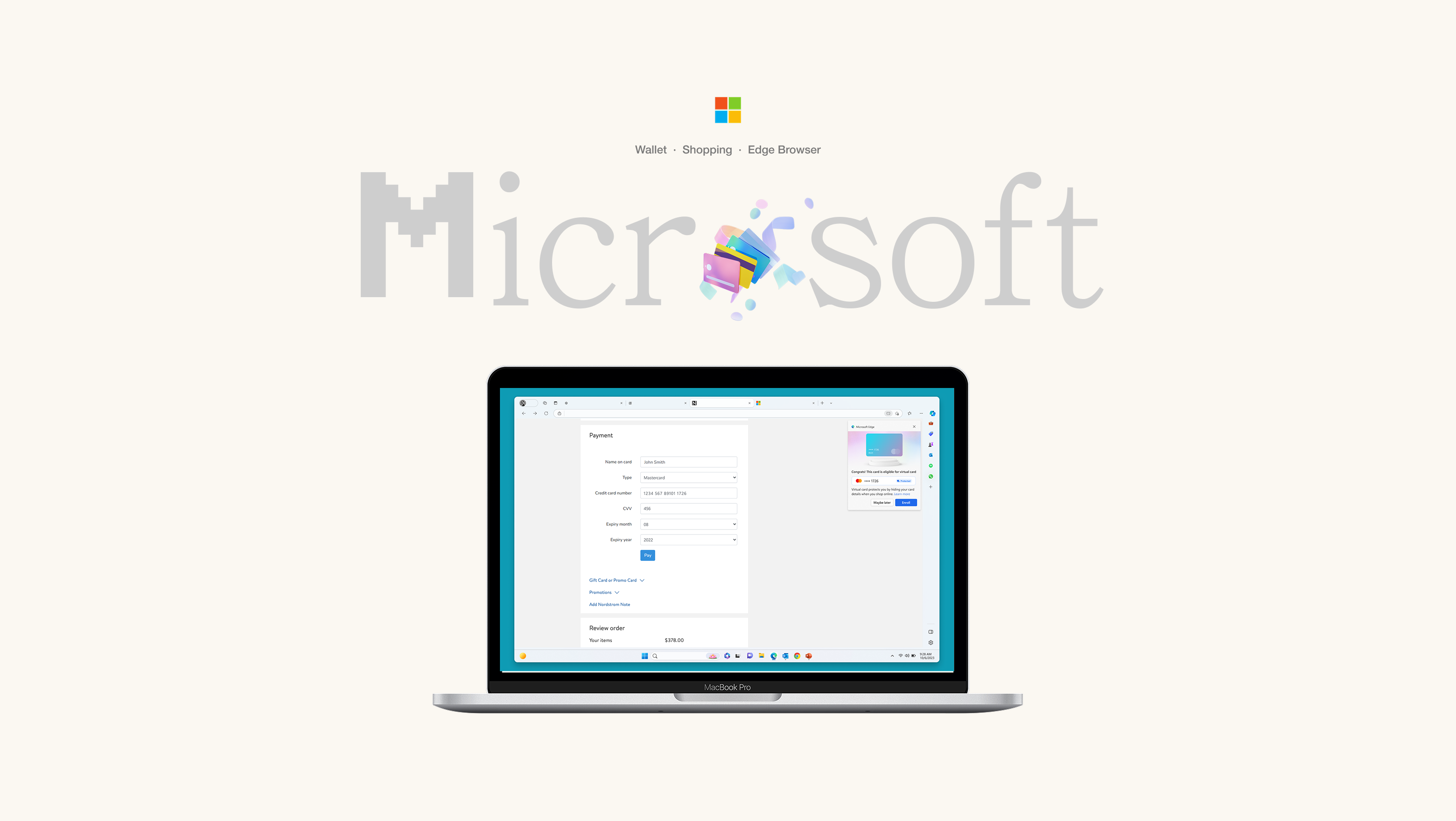
Microsoft / Wallet & Edge Browser
Platform · Fintech · B2CI helped shape Microsoft Wallet as a contextual payment companion— bringing coherence to fragmented system behavior while exploring better ways to help people choose, personalize, and use their cards.
The brief
I used the card-saving experience as an entry point to rethink how Wallet could help people understand their options, make confident decisions, and find value beyond storing payment methods.
01 / Context
Microsoft Wallet had evolved from a simple autofill tool into a broader payment ecosystem, supporting saved cards, rewards, gift cards, virtual cards, secure checkout, and cross-device sync.
These capabilities were spread across Edge, Wallet, Microsoft account, checkout pages, and settings. Each addressed a real need, but incremental additions had left the overall experience fragmented.
Make states, language, and system behavior easier to understand.
Help people choose the right payment method for the moment.
Make secure payment tools feel personal and worth using.
02 / Insights
I combined issue data, experience audits, repeated concept exploration, and a checkout-based study with 15 participants.
Across my broader Wallet work, I developed 20+ concepts. Each was informed by repeated research cycles and translated into reusable flow logic, decision frameworks, and edge-case handling.
Edge, Wallet, Microsoft account, device, and cloud storage felt like different destinations.
Sign-in, virtual cards, autosave, and verification competed with the primary payment task.
People were more willing to engage when Wallet explained what they gained from the next action.
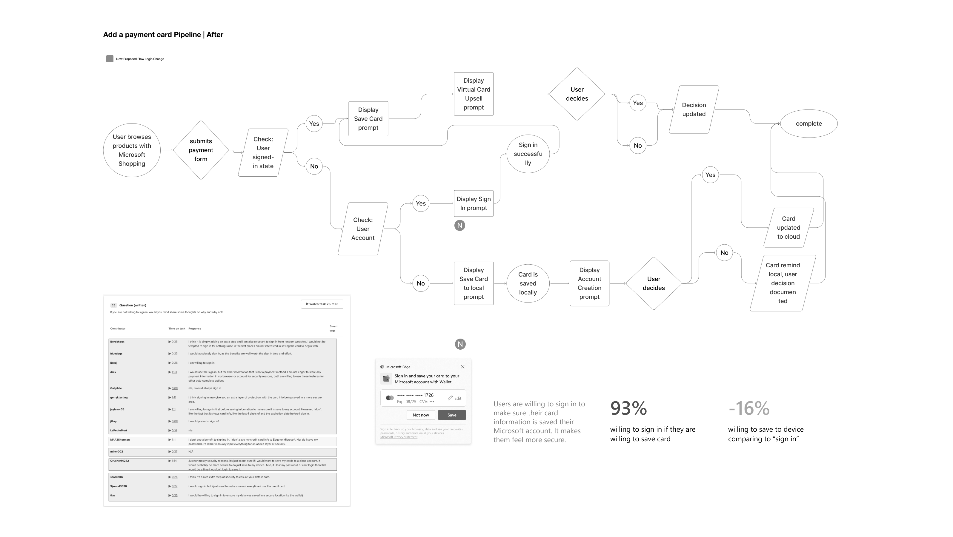
93%
When account storage and security value were clear.
79%
When saving the card remained the primary action.
15
Tested inside a realistic checkout experience.
The research percentages represent directional concept-study findings, not product conversion metrics.
03 / The problem
The card-saving flow combined local saving, account sync, sign-in, virtual card enrollment, CVV verification, and security messaging. Users struggled to understand these choices and what would happen to their payment information.
At the same time, valuable opportunities remained unexplored: helping users choose the card that maximized rewards, and making virtual cards feel more personal and engaging.
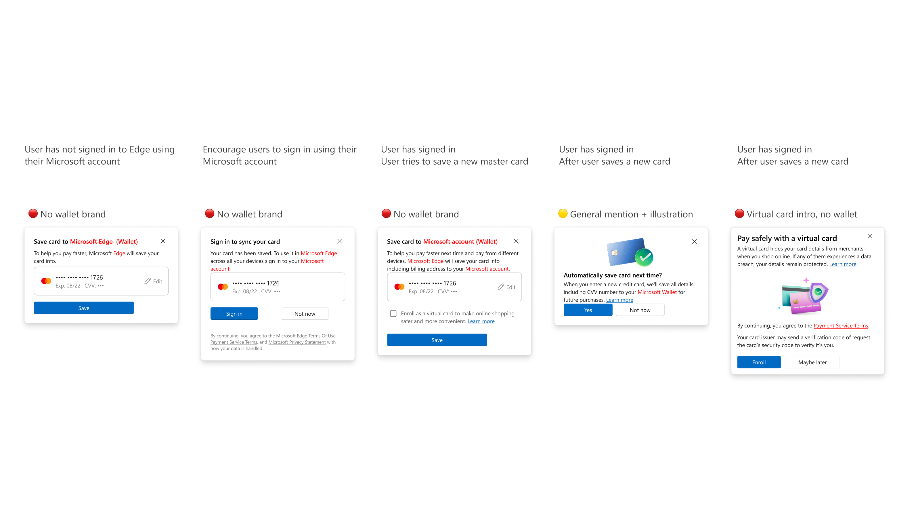
04 / Design response
I worked across two connected layers: reconstructing the system underneath and exploring what Wallet could help people feel and do.
The first created coherence through shared states, language, and decision logic. The second created value through contextual recommendations, expressive identity, and progressive support.
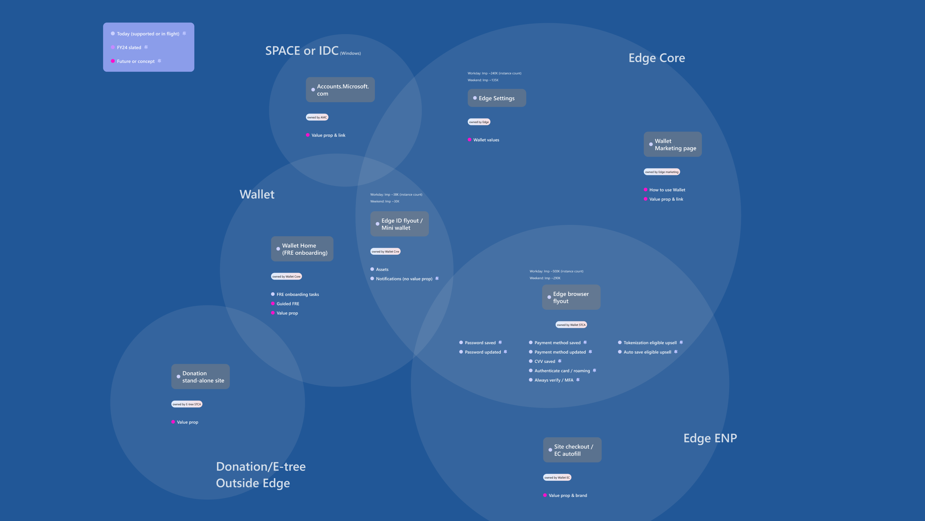
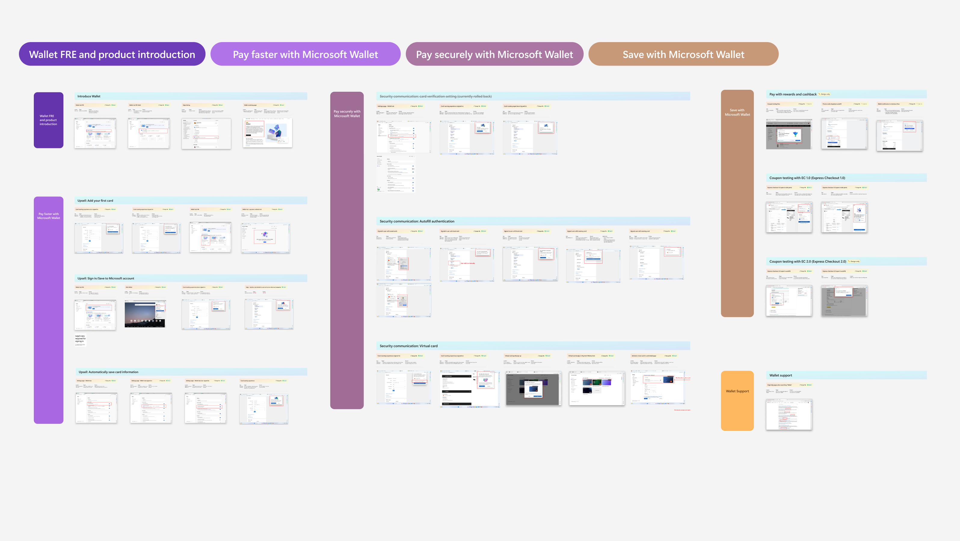
I created a Wallet communication directory covering major product surfaces, triggers, purposes, design files, and shipping status.
Before designing better messages, I made the existing system visible to the teams designing it.
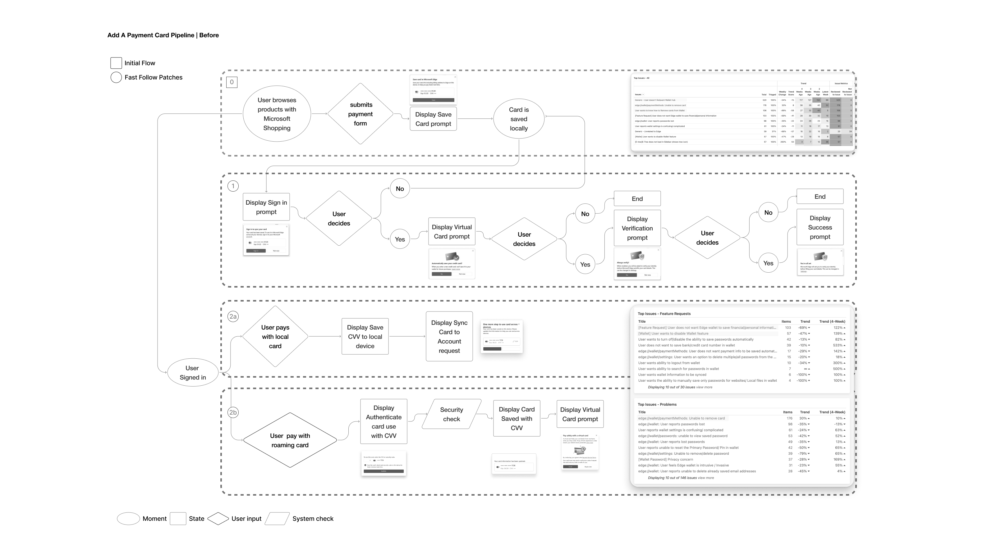
I audited the existing card-saving behavior and mapped the states behind it: signed-in status, account availability, local storage, cloud sync, virtual card eligibility, verification, and user choice.
Instead of adding another prompt, I restructured the decision logic so the system could choose the right next action based on context.
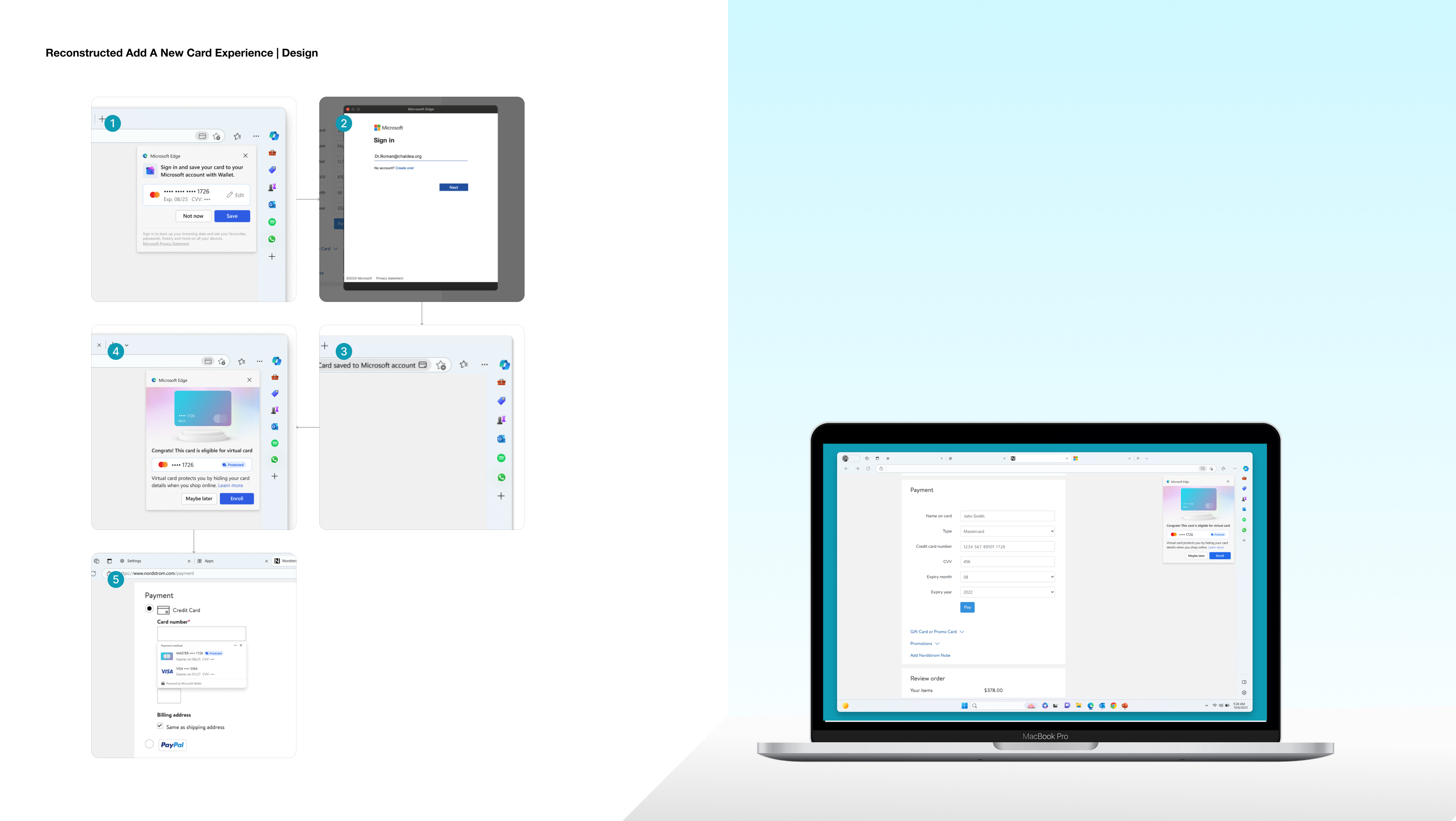
Coherence came from consistent rules—not from making every path identical.
I compared strategies that prioritized saving the card, upsell, or sign-in. Research showed that saving the card should remain the clearest first action.
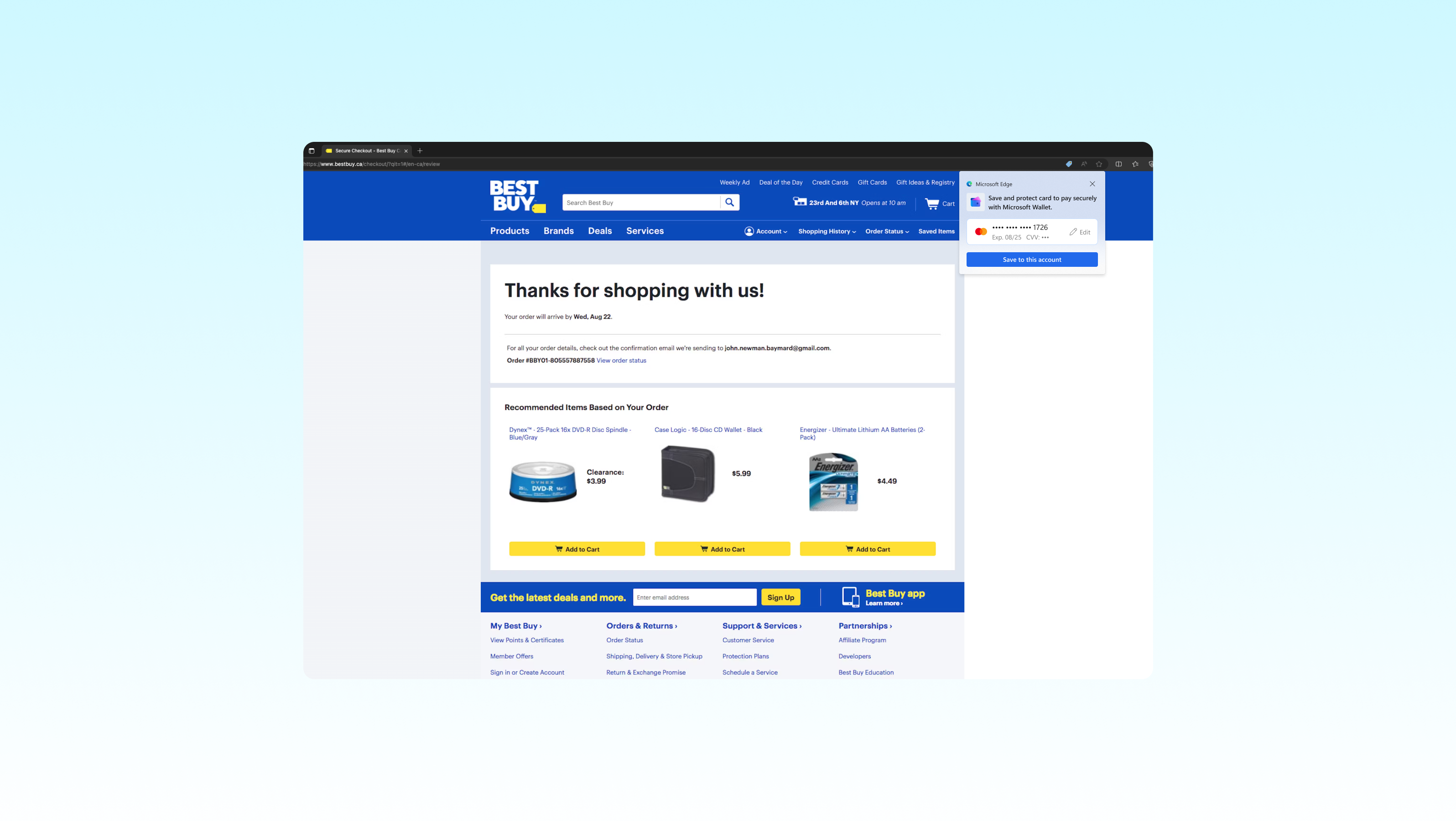
I explored a one-click payment experience that combined purchase context with available cards, cashback, points, coupons, and Microsoft rewards.
Instead of asking users to compare payment methods manually, Wallet could explain which card was most useful for the moment and make the benefit visible before payment.
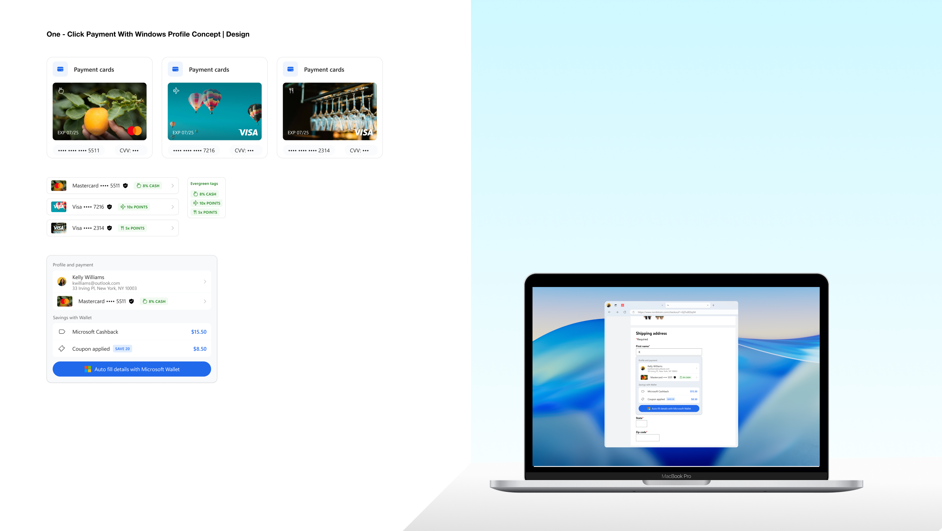
Wallet becomes a decision-support layer—not just a storage layer.
I explored a self-service virtual card customization experience where users could choose the visual identity of their card.
The goal was not decoration alone. A more expressive card could feel easier to recognize, more personal to own, and more compelling to use for online purchases.

Security becomes something users can understand and participate in, rather than a hidden system behavior.
Across the experience, I sequenced support as: save the card, explain account value, recommend the right payment method, and introduce virtual card benefits.
This kept the system helpful without making every capability compete for attention at the same time.
05 / Outcomes
The work connected Wallet’s underlying logic with the moments users actually experienced. It made the system easier to understand, more relevant during payment, and more rewarding to engage with.
A contextual product is not simply one that knows more about the user. It is one that uses context to make the next decision easier, the system state clearer, and the product more relevant.